Text reconstruction:
If you illustrate remains of Stela or wall scene, and you are planning to add a reconstruction for it and part of the reconstruction is a text of any ancient language such as hieroglyphs, Greg, etc. In this case, you do not have to draw the reconstruction signs or letters and spend much time to do it. Where this reconstruction should not be accurate.

Do as following:
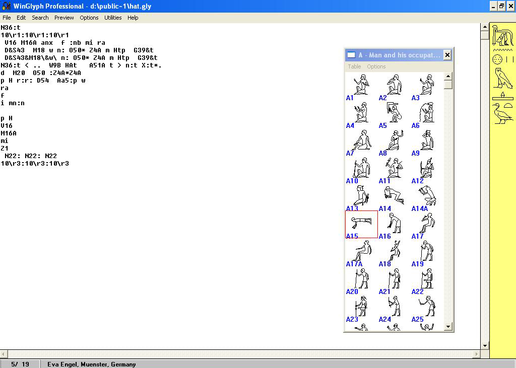
– Write the reconstruction text in the program you usually use to write it, for example, Winglyph to write Hieroglyphs.
– Make a copy of that text from the program you wrote in.
– In Adobe Illustrator, add a new layer and rename it with “Reconstruction text”.
– Paste the text in this layer.
Now this text should be treated as vector lines and paths, and you can edit it as a part of your scene and chose the suitable convention you want. In my case, I choose to make it as dashed line.
Sometimes in the case of dash lines, may the text needs some additional work, where the vector lines and paths were not converted to completed lines but cut lines. So it is preferred to choose easier convention, e.g. gray lines.
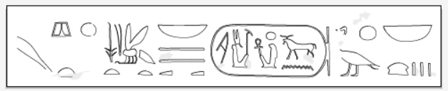
This method is not concerned to the text only but to the scenes also, e.g. in the above example the “Ankh” sign holds the fan. where you chose the signs from the signs list in the program and do the same like the text, but just you need to adjust the size and so on.
Regarding “Winglyph” for sorry the last version is compatible with Windows XP Service Pack 3 -32-bit, so whatever the pc is old or new it doesn’t matter since it has that Windows version.
so if you have for example pc with Windows 10, Winglyph will not be working. in this case, you have some options:
1- Use pc with having Windows XP Service Pack 3 -32-bit
2- Contact the online support of Windows, so they chick your pc for compatible options and they have an option with remote chicking, so you will have nothing to do but they will. The link for windows 10:
Make older programs compatible with this version of Windows – Windows Help
3- You can use one of the Hieroglyphs programs which are compatible with Windows you use, and in this article, you will find more information about it:
Hieroglyphic Text Processors, Manuel de Codage, Unicode, and Lexicography
but don’t use “Jsesh” if you plan to export to Illustrator, because it export signs with very low resolution, which is not enough.
4- So Miyagawa created Hieroglyphs font , so you can write Hieroglyphs directly on Microsoft Word.
Sun and Shadow:
Sun and shadow is one of the most important methods to express the 3D of the scene, in addition, the sunk and raised Relief.
There are many methods to represent sun and shadow in Adobe Illustrator:
In general, we always put in mind; the sun comes from the upper left side.
1-Normal cut lines:
In raised Relief, the left side has the light and the right side have the shadow.
Put you always in mind also, there is a transition area between.
Therefore, if you illustrate a circular shape, the transition area should be in the part where 45 degree is, wherever it is in the left if it is raised relieve or in the right if it is sunk relieve.
Note: the transition area should not be big but probably 10% of the sun or share area.
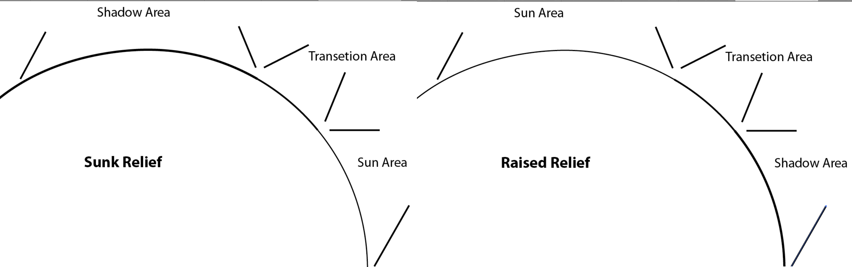
- Change the Stroke’s weight From Stroke Panel, the sun 0,5 pt, the transition 0.75 pt, and the shadow 1 pt.
- Normally the percentage between the sun, transition and the shadow is: 50%, 75% and 100% in order.
Note: you have to put the completely light sun in one layer for the whole shapes, and do the same with the transition and shadow areas. So in case you change the weight of the strokes for some reason, you don’t need to select the light lines one by one, especially if you have a big scene with hundreds of light, transition and shadow lines.
2-Use the black Background layer[1]:
This method is depend on duplicating the whole outline of shapes that want to add sun and shadow to it and copy it to another layer, as following:
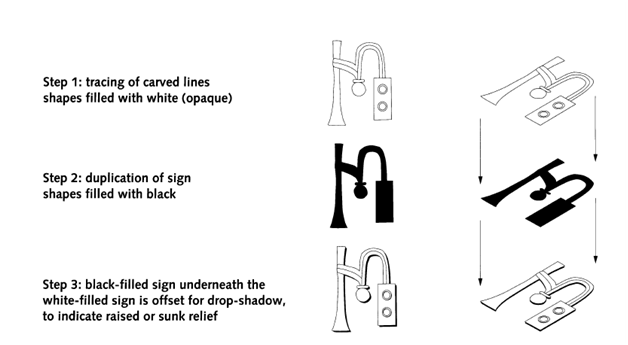
- Once the two layers are under each other (black filled outlines under the white filled outlines), select the completely black filled outlines layer.
- Use the arrows keys in the Keyboard to move the
shapes:
- For sunk relief: One move left and one move up.
- For raised relief: One move right and one move down
3- By using 3D option:
Select the shape.
Fill it with white color.
Window >Effects > 3D > Extrude & Bevel.
Sunk Relief:
From 3D Extrude & Options Panel, choose as following:
in the horizontal (x) axis : -1, vertical (y) axis : -1, and depth (z) axis : 0 in the text boxes.
Surface: No shading.

Raised Relief:
As following:
In the horizontal (x) axis : 1, vertical (y) axis : 1, and depth (z) axis : 0 in the text boxes.
Surface: No shading.
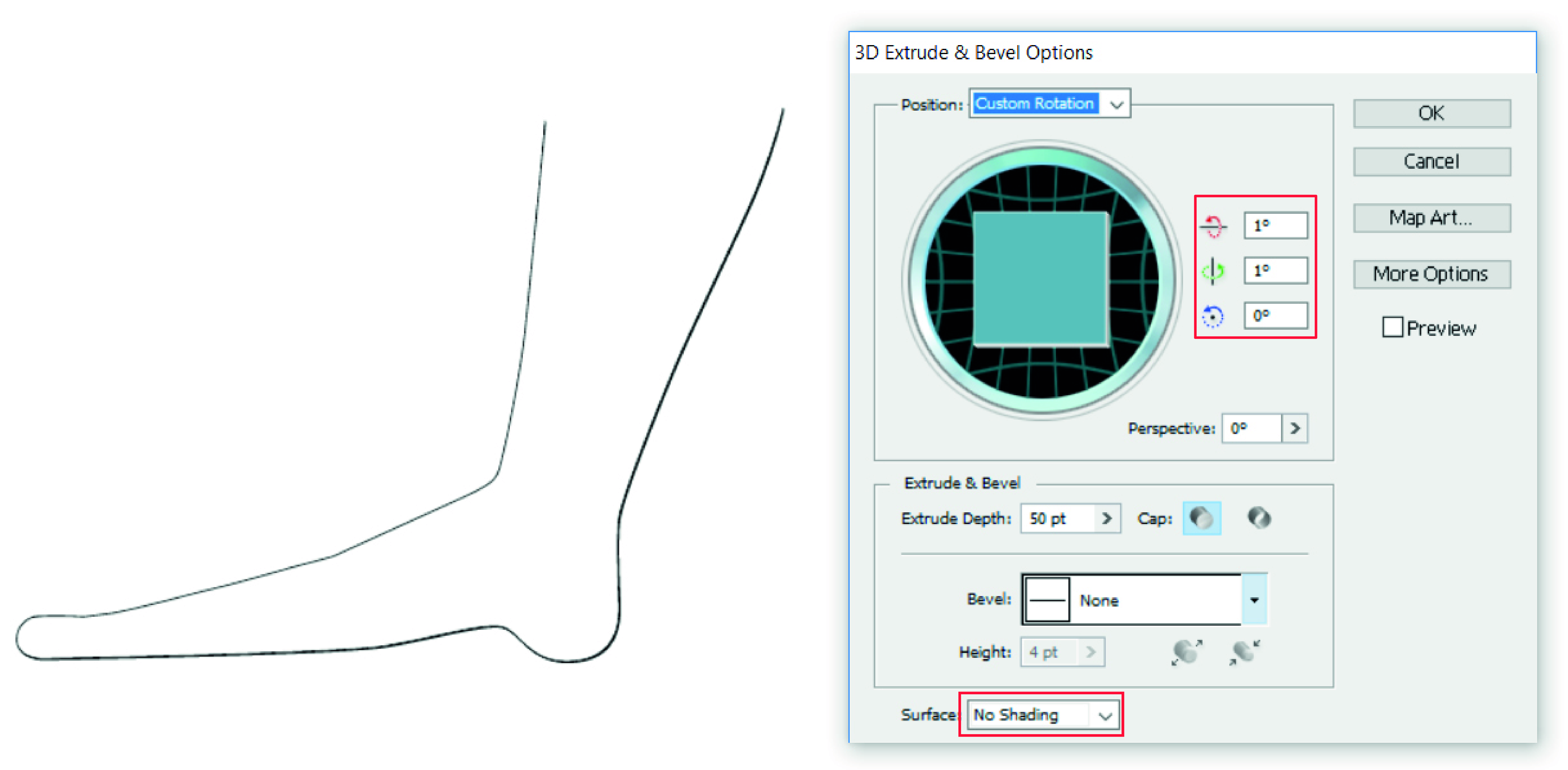
In the second and the third methods you have to put in mind the layers order because in both the Signs and the shapes have a white fill.
Comparison:
| Normal cut lines | Black Background layer | 3D option | |
| When to apply | Any time | Recommeneded after finish the whole drawings | Recommeneded after finish the whole drawings |
| Taken time | Much time | No | No |
| To be edit | hard | Much harder | Easy |
| Appling for single lines with no shapes | Yes | No | No |
| Put in mind the layers order | No | Yes | Yes |
Complicated shapes:
Sometimes you have some complicated shapes which contain sunk and raised Relief in the same sign., for example, the hieroglyphic sign R or the feet of birds. in which, if the outer part represented in sunk relieve, the inner part should be represented in raised relieve, which is somehow, you should put that in mind.
To avoid that confusing, do as follows:
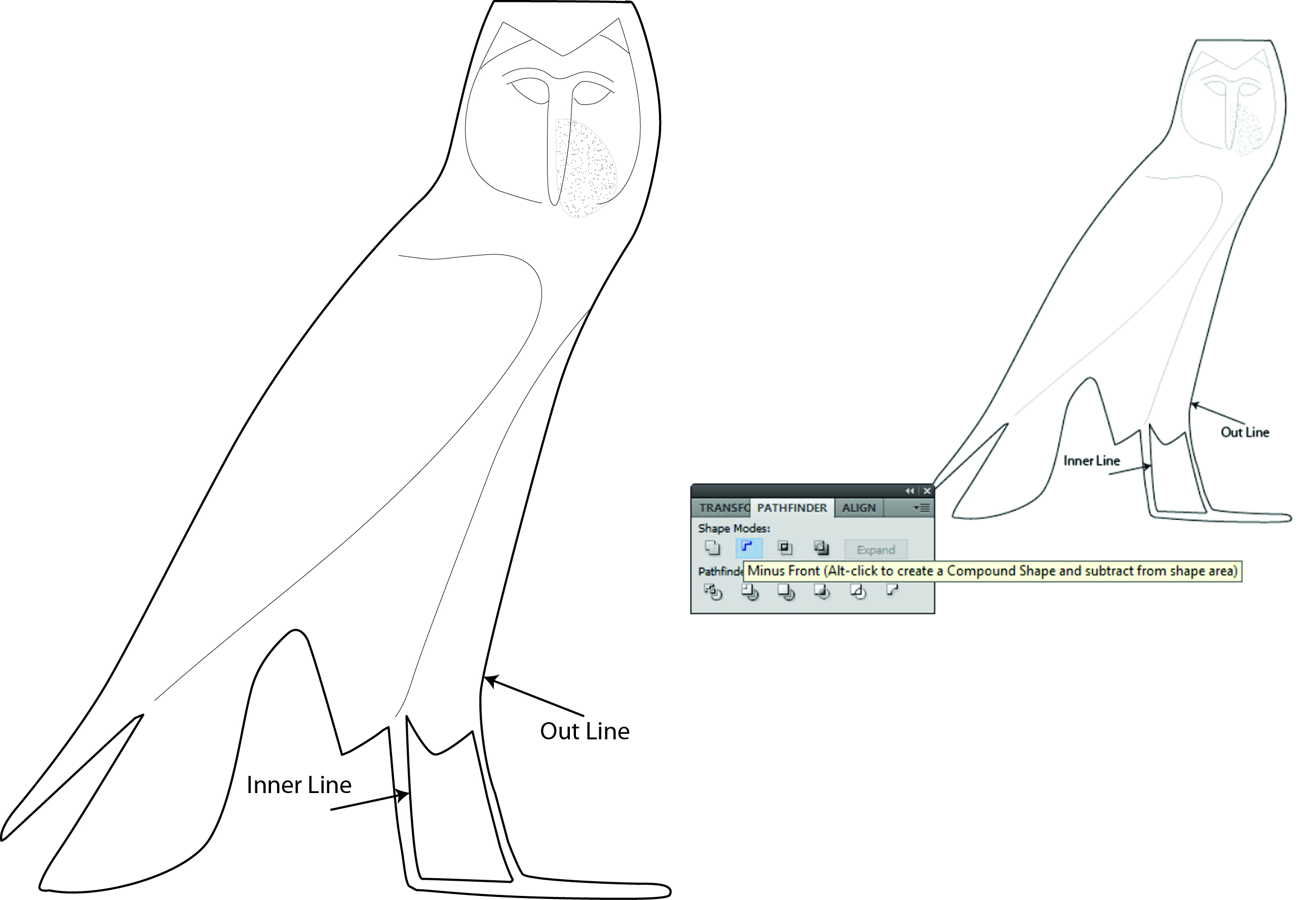
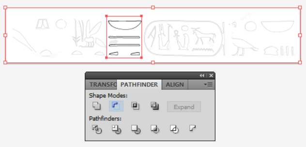
- Draw the outer lines then the inner lines.
- Select both of them by using the “Selection tool”.
- Open Pathfinders Panel Window
- Under “Shape Mode > Minus Front
- The outer and inner lines should be joined as one unit and if decided to add sun and shadow, it shouldn’t be any problem with that.
- To be sure that was happened:
- Select the shape.
- Fill it with any color.
- If it is joined, the whole shape except the inner area will be filling with this color, if not try to make sure of clothing the shapes and the inner area is in front of the outer shape.
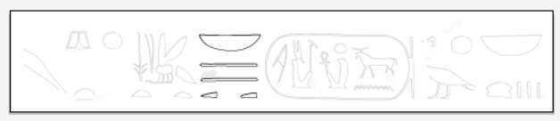
Fade view:
Sometimes you need to fade the whole scene or text except small part of it for special comment or for any reason, you follow the same steps of complicated shapes with slightly change as following:
Add new layer and rename it to”Fade” Draw rectangular with “Rectangle Tool” from Tools Box to cover the whole scene or text with fill: white. Open Window > Transparency . Choose Normal and change Opacity to 75%. You will see that the whole scene became in fade view.

Draw another shape also with Rectangle Tool, to cover the area you want to avoid the fade on it.
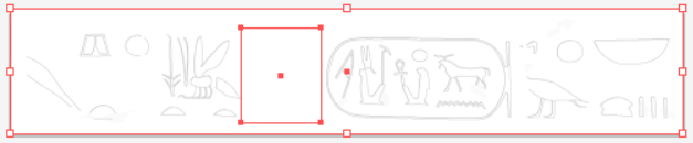
Open Window > Pathfinder.
From Shape Modes: Minous Front.
Change the struck appearance to None. You will see the whole scene is fade except the that part.
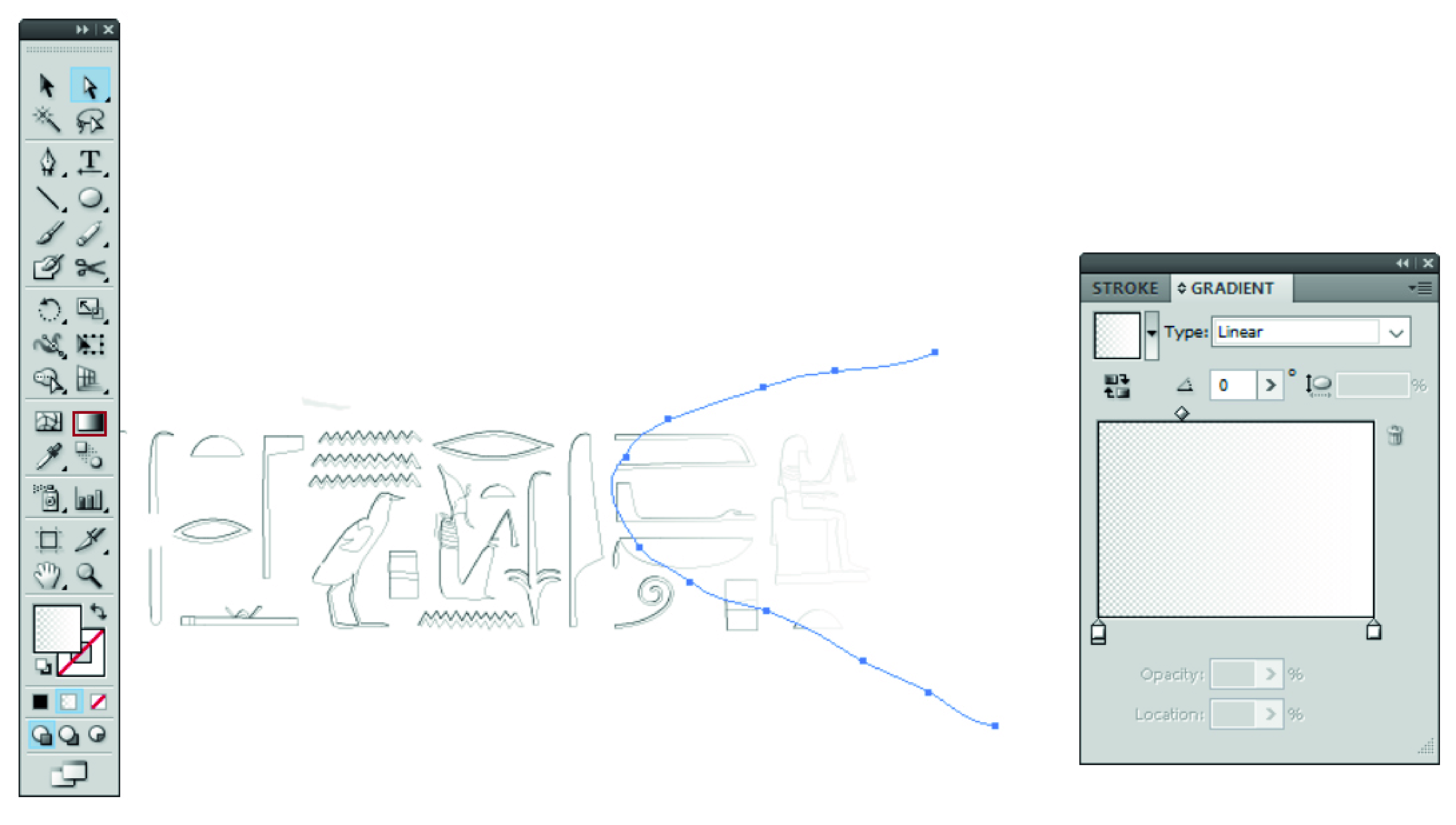
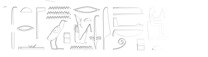
Vanish areas:
In some cases there is a scene, which have some vanish area, you can represent that as following:
- Add a new layer and rename it with Vanish, order it above the layer (or Layers) which have the drawing.
- Draw a shape with “Pencil tool” have an appearance of (Stroke: None and Fill: white) and cover the area that has the vanish scene.
- While you select that shape, click “Gradient Tool” from Tools Panel.
- Then one click on the gradient area in the Gradient Panel.
- Adjust the two ended color as following:
- Change both of them to white color, one with Opacity of 0 % and the other with Opacity 100%, depend on the direction of the vanish.
- Adjust the angle of the gradient.
- For using the “Gradient Panel” see:
Note: the Gradient Slider with Opacity 100% should be the same color as the background of the lines.
Scene tracing:
If you have inked drawings in a book or article, and want to digitize it, you can do as following:
- Scan that drawings with a high resolution e.g., 600 dpi.
- Load it to Adobe Illustrator.
- Select the photo.
- In control panel Live Trace > Detailed Illustration, a massage of tracing presses may slowly ….. will appear because of the large of the photo.
- Click ok.
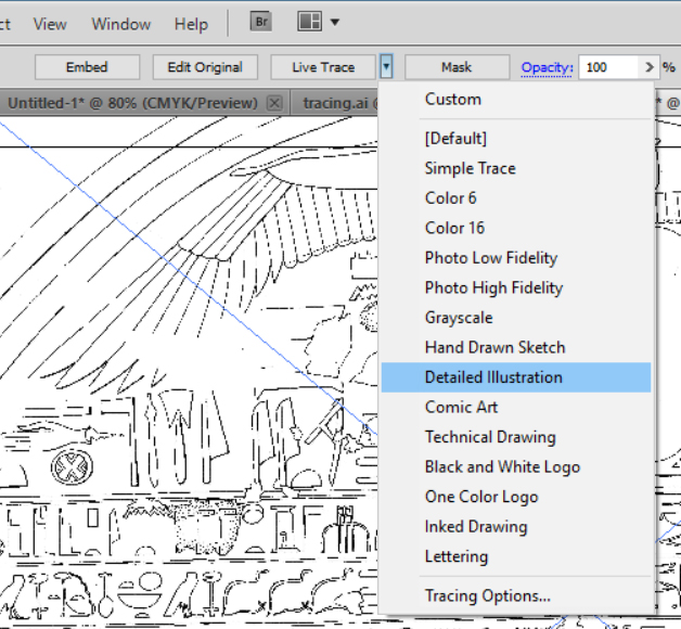
- From Control Panel click Expand.
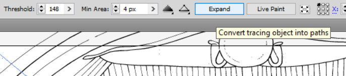
Now the photo should be converted to lines and baths, you can choose any line or bath by using “Direct Selection Tool” and edit it.
Hand Writing:
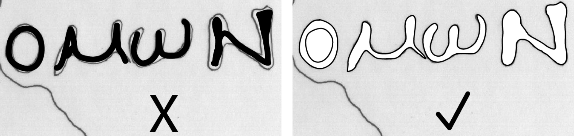
If you are going to illustrate handwriting, avoid to draw it as one line with big weight, otherwise, you will never match the letters shape with your lines. So it is better to illustrate each letter or word as a normal shape with two lines with a thickness in between.
Exporting :
Once you finish your drawings, you want to export your work for publication or printing or any purpose. If you export some shapes with no borders, the exporting figure limits will be the same as the drawn shape.
In this case do as following:
Open a new layer and rename it with a white corner.Active it.In the upper right and lower left corners, draw small squares (0.5 cm) by using “Rectangular Tool” from Tools Panel with fill and strokes of white or None.

Now export it: File > Export (choose the format you want) You will see your figures will have a space between its limit and border.

[1] – Peter Der Manuelian, Pp. 106-107.
